Two athletes can hold the same cl and be prepared for entirely different races. One built the number on long aerobic rides, the other on threshold intervals stacked into short weeks. The composite fitness chart cannot tell them apart, because a single number has no composition. The latest EndurexAI release addresses this from three sides. The fitness page now decomposes cl, al, and form by intensity zone, a rules engine watches the resulting numbers for risk, and a new periodization page turns a race date into a season plan.
The fitness page, decomposed
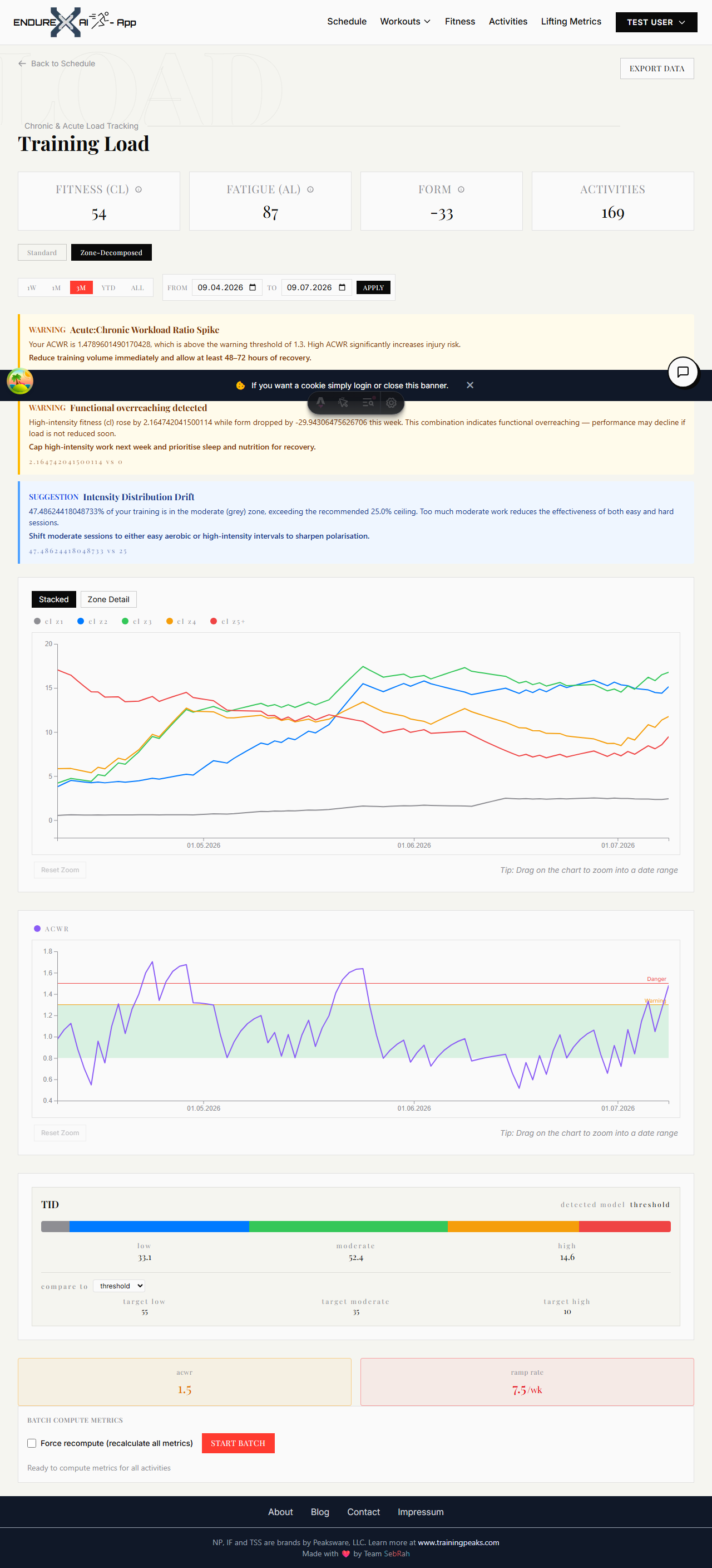
Open the Training Load page and you will find a Standard / Zone-Decomposed toggle above the chart. The standard view is the composite chart you already know. The zone-decomposed view splits every activity’s TSS into Z1 through Z5+ buckets and computes cl, al, and form separately for each zone.
The decomposition rests on the same impulse-response idea that underlies most training-load models: fitness accumulates as an exponentially weighted sum of past training and decays when training stops (Banister et al., 1975). The new part is that each zone gets its own time constants. Easy aerobic work builds slowly and holds for weeks; the fitness you earn from Z5 intervals arrives fast and leaves fast. Modelled with a single decay rate, those two kinds of adaptation get averaged into a curve that describes neither. Modelled per zone, the chart shows your aerobic base as the slow, stable layer it is, with your top end as the volatile layer sitting on top. The composite cl in the summary cards is the sum of the per-zone chronic loads, so the totals still match what you know.
A Zone Detail mode lets you select a single zone and follow its cl, al, and form in isolation, for example to watch how your threshold-zone fitness responds to a block of Z3 work.
Guardrails: ACWR and ramp rate
The zone view adds an ACWR chart, the ratio of your acute load to your chronic load. A green band marks 0.8 to 1.3, a reference line sits at 1.3, a red line at 1.5, and a summary card states the current value as safe, warning, or danger. The bands follow the workload-management literature, where ratios kept near 1.0 and weekly load increases held below roughly 10% were associated with lower injury rates (Gabbett, 2016). That literature has drawn serious methodological criticism; the ratio’s statistical properties and the absence of causal evidence mean it should not be read as a validated injury predictor (Impellizzeri et al., 2020). We treat it accordingly, as a coarse screen that flags when recent load has outgrown the base underneath it, worth a look rather than blind obedience. A ramp-rate card beside it tracks how quickly your weekly cl is climbing.
Where your intensity goes
The third chart classifies your training intensity distribution. It groups per-zone load into low, moderate, and high intensity and compares the split against three named models: polarized, pyramidal, and threshold. Observational work on elite endurance athletes consistently finds mostly-easy distributions, with roughly 80% of sessions at low intensity (Seiler, 2010), and a controlled intervention in trained athletes found polarized training outperformed threshold-focused training on key endurance variables (Stöggl & Sperlich, 2014). Whether polarized beats pyramidal remains contested, and successful athletes have raced well on both. The chart therefore labels the model your training resembles and lets you choose any model as a comparison target; it does not scold you for being pyramidal.
A season plan, built backward from race day
Decomposed numbers describe where you are. The new periodization page describes where you are going. You enter four things: the target event date, the sport, your current cl, and the cl you want on the start line. From those, EndurexAI generates a macrocycle backward from the event: a two-week competition taper, a three-week pre-competition block, a four-week specific preparation block, and a general preparation phase that absorbs the remaining lead time. The two-week taper follows the meta-analytic finding that a taper of about two weeks, with training volume reduced by 41 to 60%, maximized performance gains in competitive athletes (Bosquet et al., 2007).
Each phase carries a target cl interpolated between your current and goal values, a target intensity distribution (pyramidal during the preparation phases, polarized as racing approaches), and weekly TSS budgets in a 3:1 rhythm: three build weeks ramping upward, then a recovery week at reduced load. When the plan covers the current date, a “This week” card at the top of the page shows the week’s TSS budget and the active phase.
The plan also follows you to the training calendar. Each covered day column in week view, and each covered week row in month view, carries a thin color band for its phase: indigo for general preparation, sky for specific preparation, amber for pre-competition, red for competition. Hovering a band names the phase. Without an active plan the calendar looks just as it did before.
Signals instead of chart archaeology
A rules engine now reads these numbers daily so you do not have to reverse-engineer them from charts. It raises prioritized cards in three severities: CRITICAL, WARNING, and SUGGESTION. A weekly load jump above 10% raises a warning, an ACWR spike past 1.5 escalates, deeply negative form triggers a recovery suggestion, drift away from your phase’s intensity distribution gets flagged, and a plateau or a mistimed taper produces an adjustment suggestion. Each card names the metric, the threshold it crossed, and a recommended action, and the banner appears in both the standard and zone-decomposed views.
The AI coach reads the same state. Ask it for today’s session and it works from your current phase, the week’s remaining TSS budget, and yesterday’s load, alternating hard and easy days instead of proposing intervals the morning after your hardest session of the week.
Where to start
Toggle the fitness page to Zone-Decomposed and look at which layers your cl is made of. Then give the periodization page a race date. The charts, the calendar bands, the signal cards, and the coach all read from one model of your training; from here on, so can you.
Referenzen
- Banister, E. W., Calvert, T. W., Savage, M. V., & Bach, T. (1975). A systems model of training for athletic performance. Australian Journal of Sports Medicine, 7(3), 57–61.
- Bosquet, L., Montpetit, J., Arvisais, D., & Mujika, I. (2007). Effects of tapering on performance: a meta-analysis. Medicine & Science in Sports & Exercise, 39(8), 1358–1365.
- Gabbett, T. J. (2016). The training-injury prevention paradox: should athletes be training smarter and harder? British Journal of Sports Medicine, 50(5), 273–280.
- Impellizzeri, F. M., Tenan, M. S., Kempton, T., Novak, A., & Coutts, A. J. (2020). Acute:chronic workload ratio: conceptual issues and fundamental pitfalls. International Journal of Sports Physiology and Performance, 15(6), 907–913.
- Seiler, S. (2010). What is best practice for training intensity and duration distribution in endurance athletes? International Journal of Sports Physiology and Performance, 5(3), 276–291.
- Stöggl, T., & Sperlich, B. (2014). Polarized training has greater impact on key endurance variables than threshold, high intensity, or high volume training. Frontiers in Physiology, 5, 33.

Comments(0)
Sign in to join the conversation.