What Your Body Does Not Tell You
Your body is a poor narrator of its own training status. It reports what it feels right now: the good legs on a Tuesday, the sluggish warmup that somehow turns into a breakthrough session, the vague sense that you are fit because last Thursday’s intervals felt sharp. It does not report the structural crack forming underneath. It does not flag that the load you have been stacking for three weeks is about to buckle. It does not register that you have been running on fumes for so long that fumes have started to feel normal.
Your data, on the other hand, is brutally honest. It does not care about your ego, your race goals, or the motivational poster on your garage wall. It just counts. If you know where to look, it will flag five common training mistakes weeks before your body raises the alarm, often in the form of a flat race, a nagging injury, or the kind of fatigue that sleep cannot fix.
These are the mistakes that separate athletes who build year over year from those who keep rebuilding from the same rubble.
Mistake 1: Ramping CL Too Fast
The pattern: Your Chronic Load climbs more than 7 points per week, sustained over two or more consecutive weeks.
A particular brand of ambition shows up every January and every twelve weeks before an A-race. You look at your CL, you look at where it needs to be, you do the arithmetic, and you decide that 10 points per week should be fine. You feel good, the legs are responding, the sessions are hitting the marks.
The problem is that it works, briefly, and then it stops working. A CL ramp rate above 5 to 7 points per week is a reliable precursor to illness and injury in endurance sport. Gabbett’s work on acute-to-chronic workload ratios demonstrated that rapid spikes in training load, particularly those exceeding 1.5 times the chronic baseline, significantly increase injury risk [1]. The European College of Sport Science and the American College of Sports Medicine have jointly identified sustained high training loads without adequate recovery as a primary pathway to overtraining syndrome [2]. The cardiovascular system can absorb the load for a while, but connective tissue, hormonal balance, and immune function operate on slower clocks [2]. By the time your Achilles tendon or your cortisol levels send a distress signal, you are already three weeks deep into damage.
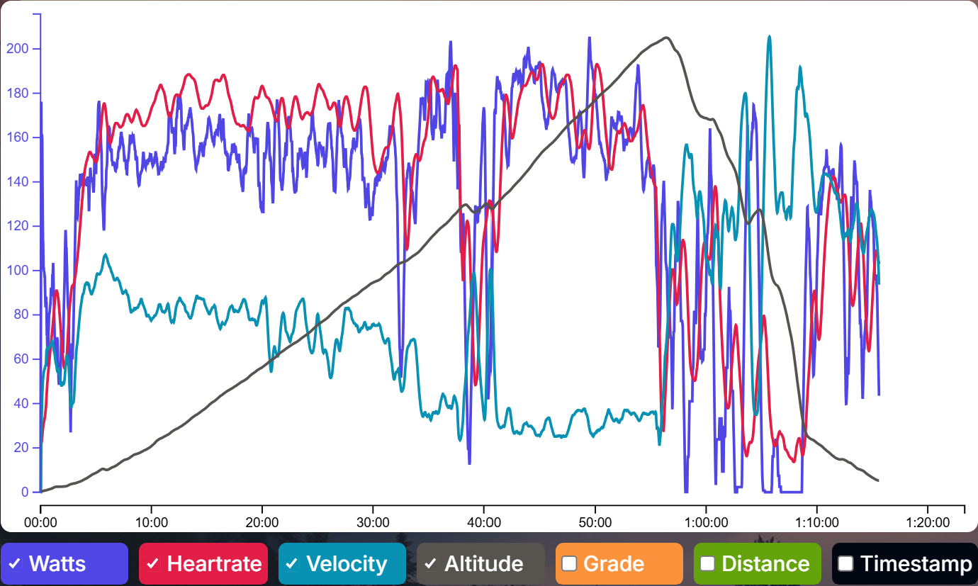
What the data shows: A CL chart with a slope that looks more like a staircase than a gentle ramp. Week-over-week jumps that consistently exceed 5 to 7 points without intervening recovery. On the EndurexAI Performance Management Chart, this shows up as a fitness line climbing at an angle your body was never designed to sustain.
The fix: Set a ceiling. During build phases, target 3 to 5 points per week, consistent with the acute-to-chronic workload ratio guidelines that Gabbett recommends to keep injury risk low [1]. If you are returning from a break or new to structured training, stay closer to 3. Compare your actual ramp rate against your target every Sunday evening. If you are overshooting, cut the next week’s volume by 15 to 20 percent. You will still gain fitness, just without the invoice that arrives six weeks later.
Mistake 2: Monotonous Intensity Distribution
The pattern: Your training intensity distribution is neither polarized nor pyramidal. It is a formless blob clustered around moderate effort.
This is the most insidious mistake on the list because it disguises itself as hard work. You finish every session feeling like you did something. Your average heart rate is always elevated. You never feel fresh, but you never feel destroyed either. Coaches call this the “gray zone,” where effort is too hard to recover from quickly and too easy to trigger meaningful adaptation.
The science on intensity distribution is increasingly clear [3][4]. Elite endurance athletes across cycling, running, swimming, and cross-country skiing tend to follow one of two models: polarized (roughly 80% easy, 20% hard, very little moderate) or pyramidal (mostly easy, some moderate, a small peak of hard) [5]. What they almost never do is spend the majority of their time at moderate intensity. Stöggl and Sperlich found that polarized training produced greater improvements in key endurance variables than threshold, high-intensity, or high-volume training models [5]. The middle zone generates fatigue without a proportional return on fitness.
What the data shows: When you look at your training distribution across heart rate or power zones over a 4 to 8 week block, a healthy distribution has a clear shape: a tall bar on the left (easy), a shorter bar on the right (hard), and not much in the middle. A problematic distribution looks like a bell curve centered on Zone 3. If your time-in-zone breakdown on EndurexAI shows a fat middle and skinny tails, your intensity distribution is working against you.
The fix: Polarize deliberately. Make your easy days genuinely easy: conversational pace, Zone 1 to 2 heart rate, the kind of effort where you feel slightly guilty about how comfortable it is. Then make your hard days legitimately hard: threshold intervals, VO2max repeats, race-pace work that leaves you empty. The gap between easy and hard should feel dramatic. If every session feels like a 6 out of 10, something needs to change.
Mistake 3: Ignoring Chronic Fatigue Signals in AL Trends
The pattern: Your Acute Load stays elevated for extended periods without meaningful dips, even during planned recovery weeks.
AL is supposed to oscillate. It rises during hard training blocks and falls during recovery. This oscillation is not a bug; it is the fundamental mechanism through which your body adapts. Stress, then recovery, then adaptation [6]. The problem emerges when the recovery part of the cycle gets quietly eroded.
It usually starts innocently. You take a recovery week but keep one “maintenance” session that is a little too hard. Or you reduce volume but increase intensity because you do not want to lose sharpness. Or you go for an easy spin that turns into a group ride that turns into a race. The result is a recovery week that never delivers recovery. Your AL dips slightly, but it never drops to the level your body needs to consolidate the work you have done.
Over time, this creates a ratchet effect. Each training block starts from a higher fatigue baseline than the last. You can sustain this for a surprisingly long time, weeks or even months, before the consequences become undeniable. But the data sees it immediately.
What the data shows: On your AL trend line, look for the valleys. In a well-structured program, recovery weeks should produce a clear and visible drop in AL. Foster’s monitoring framework emphasizes that training load must include planned periods of reduced loading to avoid the transition from functional overreaching to nonfunctional overreaching [6]. Kellmann’s work on stress and recovery monitoring similarly shows that athletes who maintain insufficient recovery troughs accumulate fatigue that degrades subsequent training quality [7]. If your AL valleys are getting progressively shallower, if the troughs are rising even as the peaks stay constant, you are accumulating a fatigue debt. The EndurexAI Performance Management Chart plots this trend automatically, and flattening AL valleys become obvious once you know to look for them.
The fix: Guard your recovery weeks with the same discipline you bring to your hardest sessions. Set an AL ceiling for recovery weeks and do not exceed it. A practical approach: during a recovery week, reduce your training volume substantially enough that AL shows a clear and visible drop on your chart, not just a minor dip. If the drop is not visible, you did not recover; you just trained a little less. There is a difference, and your next training block will know it.
Mistake 4: Skipping Recovery Weeks and Accumulating Deep Fatigue
The pattern: Your training log shows three, four, or five consecutive build weeks with no planned deload. Form is chronically negative, often below -20 for extended periods.
This mistake is related to the previous one but deserves its own category because of how common and how destructive it is. Many self-coached athletes operate without scheduled recovery weeks, reasoning that they will take it easy when they feel like they need it. The problem with this approach is that chronic fatigue erodes your ability to accurately perceive how tired you are. Fatigue becomes your new normal. You do not feel terrible; you just feel like this is how training feels. Meanwhile, your Form is sitting at -25 and has been for three weeks.
The research on overtraining syndrome consistently identifies this pattern [2][8]: sustained periods of negative Form without adequate recovery, combined with monotonous training load (see Mistake 2). The athlete does not collapse dramatically. Instead, performance quietly plateaus or regresses, sleep quality degrades, resting heart rate creeps up by a few beats, and motivation erodes in ways that feel psychological but are physiological [7]. Halson and Jeukendrup’s analysis of overreaching and overtraining research confirmed that the transition from functional to nonfunctional overreaching is gradual and often undetectable by subjective measures alone [8].
What the data shows: A Form line that lives below -15 or -20 for more than two consecutive weeks. A CL curve that never flattens or dips, just an unbroken climb. On the EndurexAI Performance Management Chart, this looks like a fitness line and a fatigue line running in parallel, with the form line buried in negative territory.
The fix: Schedule recovery weeks in advance and treat them as non-negotiable. A widely used structure is three weeks of building load followed by one week of reduced volume, though some athletes respond better to a 2:1 ratio [11]. Issurin’s block periodization model supports planned recovery phases at regular intervals, noting that the specific ratio should be adjusted based on individual recovery capacity and training age [11]. During recovery weeks, let your Form rise to at least -5 or preferably to zero. If it does not get there, extend the recovery by a few days. The fitness you lose during a properly timed recovery week is trivial compared to the fitness you protect.
Mistake 5: Under-Fueling Masked by Performance Plateaus
The pattern: CL is rising, training load is appropriate, recovery is adequate, but performance metrics (power at threshold, pace at lactate turn point, heart rate at given outputs) are stagnant or declining.
This is the ghost in the machine. Everything looks right on paper. You are training consistently, recovering properly, building fitness at a sustainable rate. But the outcomes are not matching the inputs. Your FTP test comes back flat. Your 5K time trial is unchanged. Your heart rate at threshold is drifting upward over weeks, meaning your cardiovascular system is working harder to produce the same output.
When training load and recovery are both appropriate and performance still stalls, the culprit is often energy availability [10]. Under-fueling, sometimes called Relative Energy Deficiency in Sport (RED-S) [9], does not always present as dramatic weight loss or obvious hunger. It can be subtle: a 200 to 300 calorie daily deficit that compounds over weeks, gradually degrading your body’s ability to adapt to training stress. Loucks et al. established that an energy availability below approximately 30 kcal per kg of fat-free mass per day impairs physiological function in exercising women, and subsequent research has extended similar thresholds to men [10]. The training is doing its job. Your body simply does not have the raw materials to respond.
What the data shows: On EndurexAI, this surfaces as a divergence between your fitness metrics and your performance metrics. CL is climbing, but your recorded power outputs or pace numbers at similar perceived efforts are flat or declining. Your efficiency factor (the ratio of output to heart rate) is trending downward. The platform’s activity analytics make this divergence visible by plotting these trends side by side. When the lines that should be moving together start moving apart, something is off.
The fix: If your training metrics look healthy but performance is stagnant, audit your nutrition before changing your training. Track caloric intake for two weeks, not to restrict, but to verify. Most endurance athletes underestimate their energy expenditure and overestimate their intake. A sports dietitian can calculate your energy availability (calories consumed minus exercise expenditure, divided by fat-free mass) [10] and determine whether you are above the threshold needed for adaptation. The cheapest performance gain in endurance sport is often just eating enough.
How EndurexAI Surfaces These Patterns Automatically
The five mistakes above share a common thread: they are all visible in the data before they are visible in the body. The challenge has always been that most athletes do not have the time, expertise, or discipline to audit their own training metrics with the rigor required to catch these patterns early.
This is where the EndurexAI dashboard earns its place on your screen. The Performance Management Chart does not just display CL, AL, and Form; it contextualizes them. Ramp rate alerts flag when your CL is climbing too steeply. Recovery adequacy tracking monitors whether your deload weeks are delivering the AL reduction your body needs. Intensity distribution analysis breaks down your time in zones across configurable time windows, making it obvious when you are drifting into the gray zone.
The platform watches the trends so you can focus on the training. It does not replace your judgment or your coach; it amplifies both by surfacing the signals that matter most, at the moment they start to matter.
The Athlete Who Reads the Dashboard
There is a version of you six months from now who is fitter, fresher, and faster, not because you trained harder, but because you trained with better information. That version of you checks the ramp rate on Sunday evenings, reviews intensity distribution at the end of every training block, takes recovery weeks seriously, eats enough to fuel adaptation, and treats the Performance Management Chart as the early warning system it was designed to be.
The data is already there, in every workout you upload, every session you log. It has been trying to tell you something. The only question is whether you will listen before your body forces the conversation.
References
[1] Gabbett TJ. The training-injury prevention paradox: should athletes be training smarter and harder? British Journal of Sports Medicine. 2016;50(5):273-280. doi:10.1136/bjsports-2015-095788
[2] Meeusen R, Duclos M, Foster C, et al. Prevention, diagnosis, and treatment of the overtraining syndrome: joint consensus statement of the European College of Sport Science and the American College of Sports Medicine. Medicine & Science in Sports & Exercise. 2013;45(1):186-205. doi:10.1249/MSS.0b013e318279a10a
[3] Seiler S. What is best practice for training intensity and duration distribution in endurance athletes? International Journal of Sports Physiology and Performance. 2010;5(3):276-291. doi:10.1123/ijspp.5.3.276
[4] Seiler KS, Kjerland GO. Quantifying training intensity distribution in elite endurance athletes: is there evidence for an “optimal” distribution? Scandinavian Journal of Medicine & Science in Sports. 2006;16(1):49-56. doi:10.1111/j.1600-0838.2004.00418.x
[5] Stöggl T, Sperlich B. Polarized training has greater impact on key endurance variables than threshold, high intensity, or high volume training. Frontiers in Physiology. 2014;5:33. doi:10.3389/fphys.2014.00033
[6] Foster C. Monitoring training in athletes with reference to overtraining syndrome. Medicine & Science in Sports & Exercise. 1998;30(7):1164-1168. PMID:9662690
[7] Kellmann M. Preventing overtraining in athletes in high-intensity sports and stress/recovery monitoring. Scandinavian Journal of Medicine & Science in Sports. 2010;20(Suppl 2):95-102. doi:10.1111/j.1600-0838.2010.01192.x
[8] Halson SL, Jeukendrup AE. Does overtraining exist? An analysis of overreaching and overtraining research. Sports Medicine. 2004;34(14):967-981. PMID:15571428
[9] Mountjoy M, Sundgot-Borgen JK, Burke LM, et al. IOC consensus statement on relative energy deficiency in sport (RED-S): 2018 update. British Journal of Sports Medicine. 2018;52(11):687-697. doi:10.1136/bjsports-2018-099193
[10] Loucks AB, Kiens B, Wright HH. Energy availability in athletes. Journal of Sports Sciences. 2011;29(sup1):S7-S15. doi:10.1080/02640414.2011.588958
[11] Issurin VB. New horizons for the methodology and physiology of training periodization. Sports Medicine. 2010;40(3):189-206. doi:10.2165/11319770-000000000-00000

Comments(0)
Sign in to join the conversation.